In this blog, I want to address the psychological aspects of Real Estate Photography.
In the past 3 blogs, I’ve talked about standing out from the rest of the photographers by PhotoShop techniques, considerations of articles left in the house (lighting, window dressings, etc.), architectural signatures(arched doorways, etc.)and angles but in this blog, I want to address certain psychological issues that need to be acknowledged.
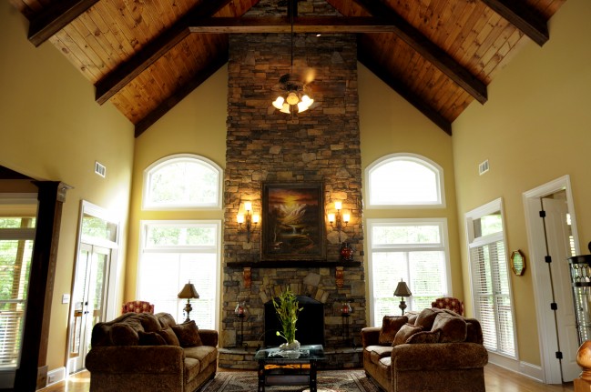
Clients like to see listings that are clear of clutter, spacious and bright. It would be smart to keep these qualities in mind when shooting a listing.
Lack of clutter makes the potential client “feel” that the previous owners were not slobs…that they were conscience of taking care of the house. That is important and can be “far-reaching” in it’s implications. Not to mention, lack of clutter makes a house feel larger. Also, attention to the spacious quality of a house can not only leave a client feeling that the house is larger, but seeing that quality in a photograph, actually draws them into the house emotionally.
I say this because, many photographers walk in to a room, face the apex of the room and take the picture. This actually does nothing for the room and can make the viewer feel claustrophobic about that room. Visually, it offers no where to turn. If you can shoot a room in relation to other rooms or hallways, it opens that space and gives the viewer movement, making them feel there is space to move in the house. Again…they’re moving in the house (subconsciously).
The brightness of a house makes it feel more open and full of life. Light also makes one feel that a listing is cleaner and they sense a “lighter” energy about the house.
It can also add a sense of size….larger.
The best way to convey light in a room is to shoot with a tripod. That way, you can use long exposures that flood the room with the light from the windows. If you want to show the window dressings, you must experiment a little with the exposure, not to blow it out and obliterate the window treatment.
You’ll find that some of the “cleaning” comes from PhotoShop tools. Stamping is the most common used. I typically eliminate cords, some light switches, alarm systems, dirt spots, and anything else that draws the eye to it, rather than contributing to the overall flow of a large and open space.
It’s all about having the client move through the house mentally. That way, they feel as if they experience the house on a more intimate level, thus feeling a part of the house BEFORE the see it in person.
Exteriors of a house is dealt with the same way. Most agents take their photos standing right in the front of the house. This actually stops the viewer from moving towards the house. Were a photograph shot from “off center”, it has more appeal because the viewer travels down the side of the house or feels the volume of the house. Again, they feel movement towards the house rather than being halted in the front yard.
I hope these tips have helped you in understanding my approach to shooting Real Estate Photography. I have had great comments on my work and it pays off when my clients sell their listings and where told that the photography had a lot to do with it.
Good Shooting!